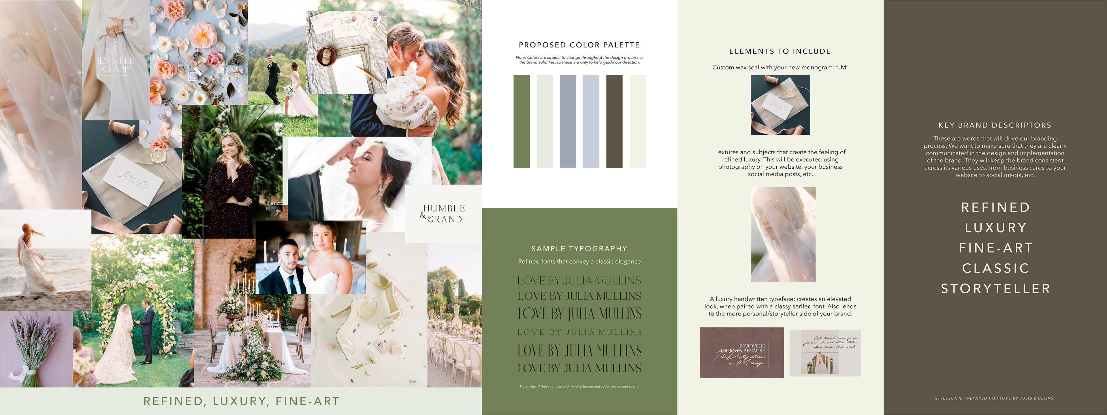
Before I began creating the visual brand elements, I built a brand strategy. Pulling photos from Pinterest and from my client's website, I summarized the brand direction in a visual stylescape that would inform our branding process.
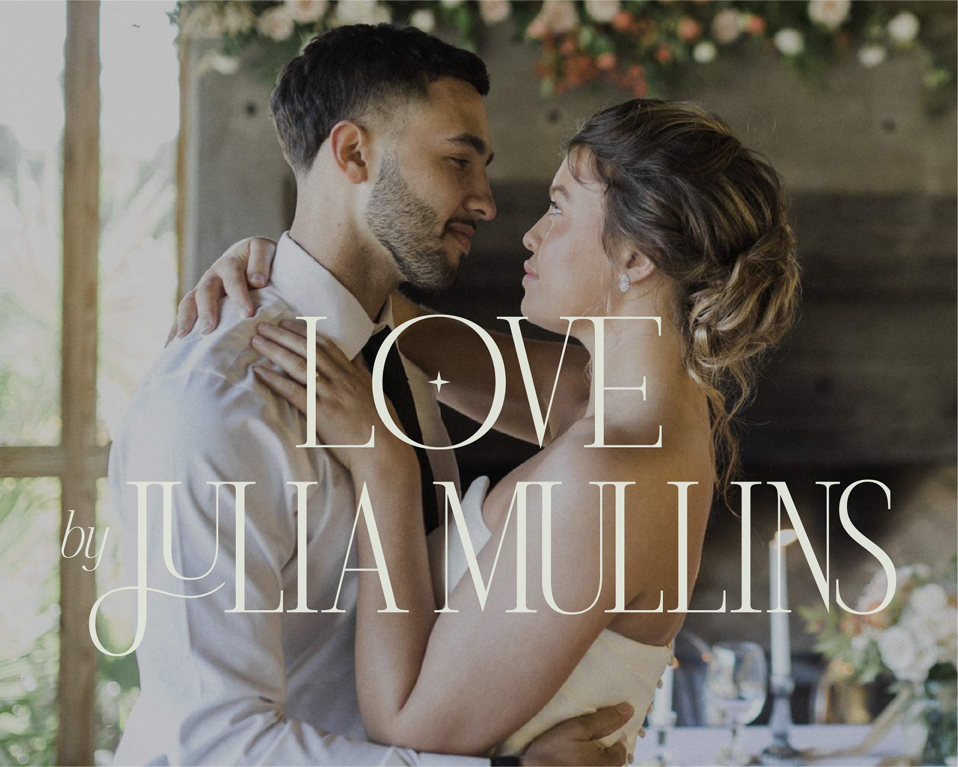
One of my favorite steps in this process was the chance to customize an already-beautiful font for the main logo. I’ve been wanting to get into custom type more lately, so this was a great opportunity to exercise those creative muscles.
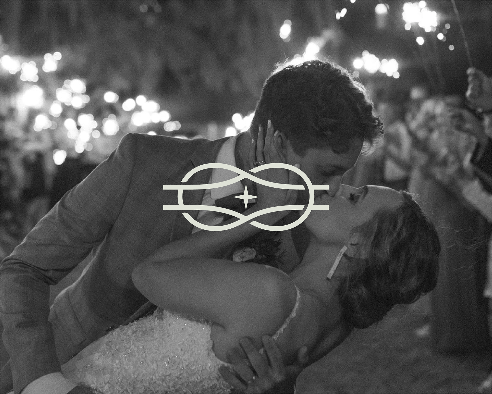
The knot icon represents the word "Love" in Love by Julia Mullins, the heart behind the business.
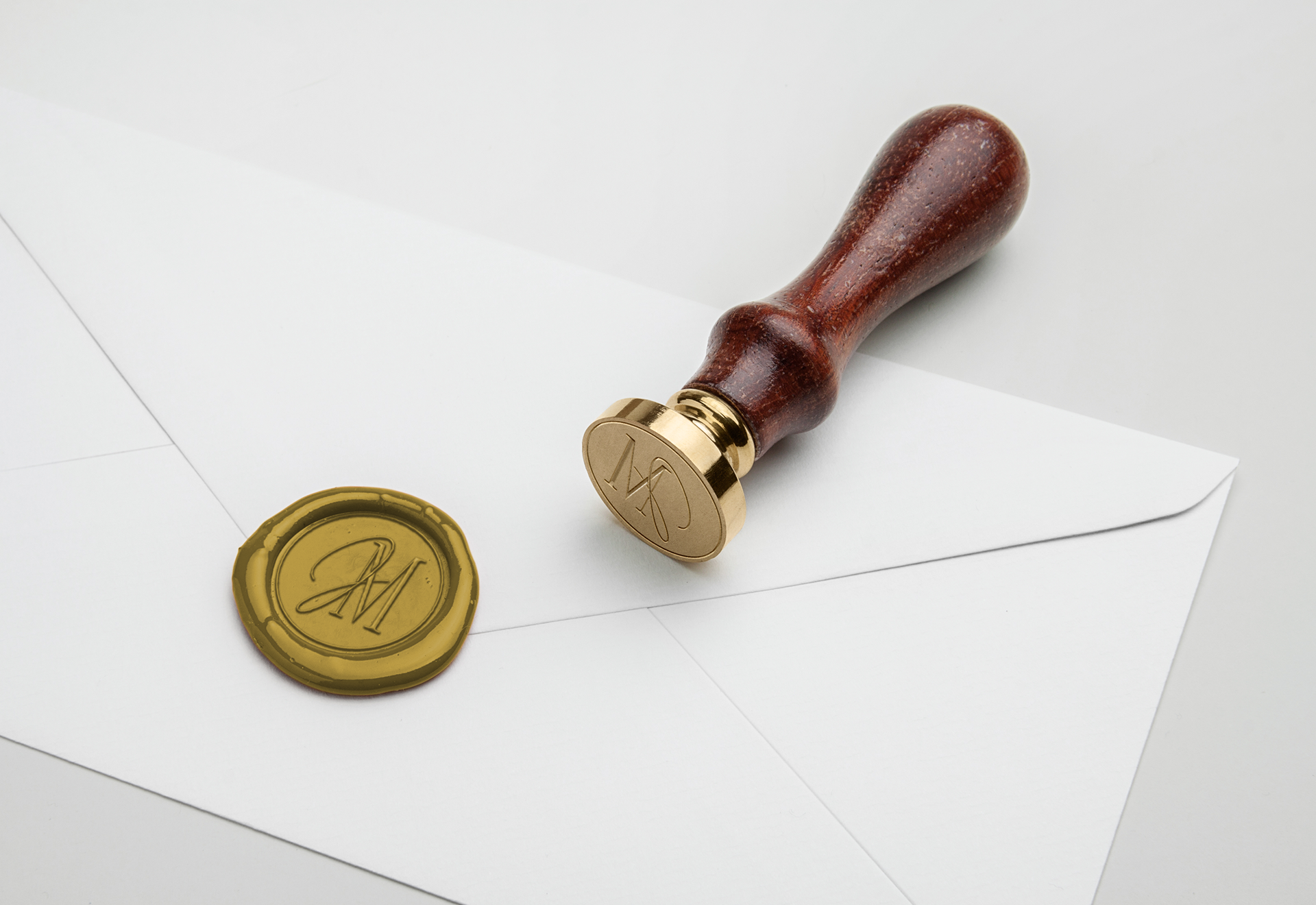
Julia wanted to have a physical wax seal to add a personal fine-art flair to her client interactions. I created a wax seal design using her new monogram.
Check out her photography here: Love by Julia Mullins