Before this year, the sermon series theme graphics had never been integrated into Cedarville's social media platforms. Theme graphics were usually found on their website, in chapel, or around campus on small banners hung from lamp posts. Chapel has often been referred to as the "heartbeat" of campus, but Cedarville's social media presence regarding chapel felt bland. So this year, they wanted to try something different and more modern. Inspired by The Porch's Instagram (a popular Dallas-based young adults ministry), they tasked me with developing themed social media templates that their marketing team could use to create chapel posts throughout the year in addition to a handful of graphics to introduce the new series. The hope was that this could connect the in-person experience of a Cedarville University chapel to Cedarville's social media presence for a more cohesive feel.
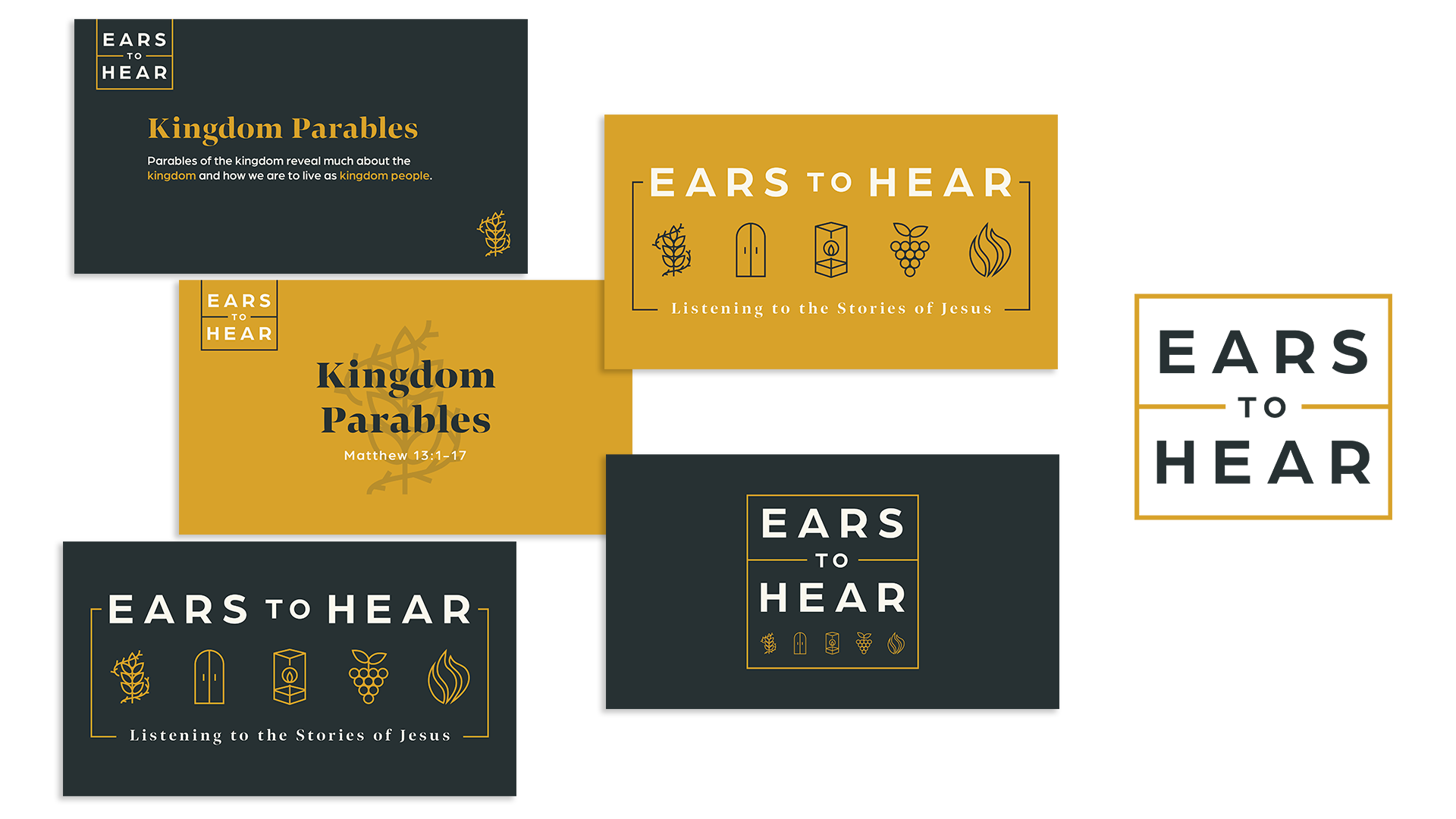
Option 1: 5 Icons represent notable parables from each main category of parables.
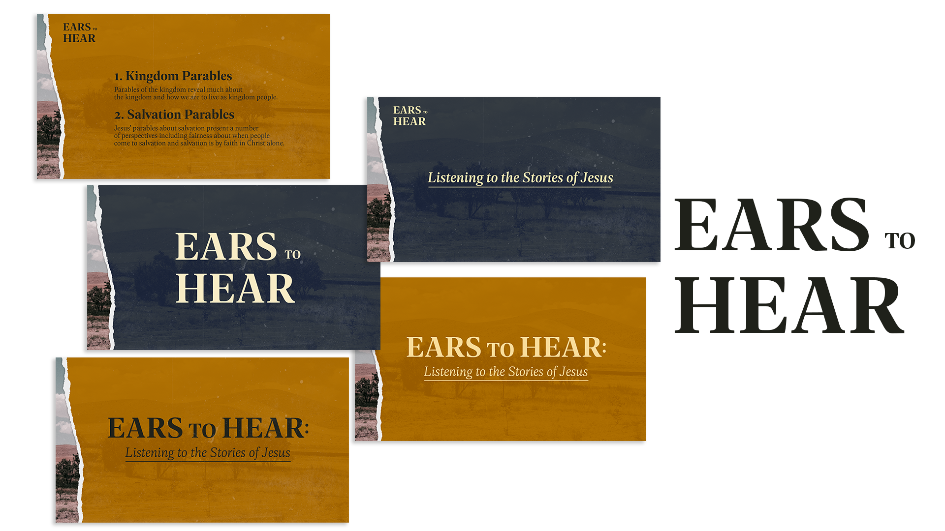
Option 2: Images show the locations in which Jesus shared parables
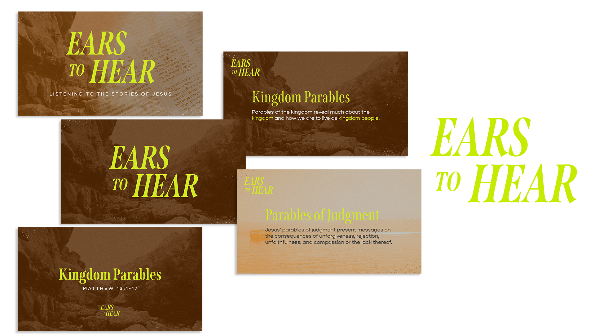
Option 3: Combinations of images and textures, paired with bright green type
Above: The three different directions that I created for Cedarville University. They went with Option 1.
After Option 1 was chosen, the client decided that they wanted the icons to represent 5 categories, rather than 5 parables. The icons were refined to fit the 5 categories: Kingdom, Salvation, Wisdom & Folly, Christian Life, and Judgment.
With the brand elements that I created, my husband put together this hype video to be used in Cedarville University chapel as an introduction to the message series.
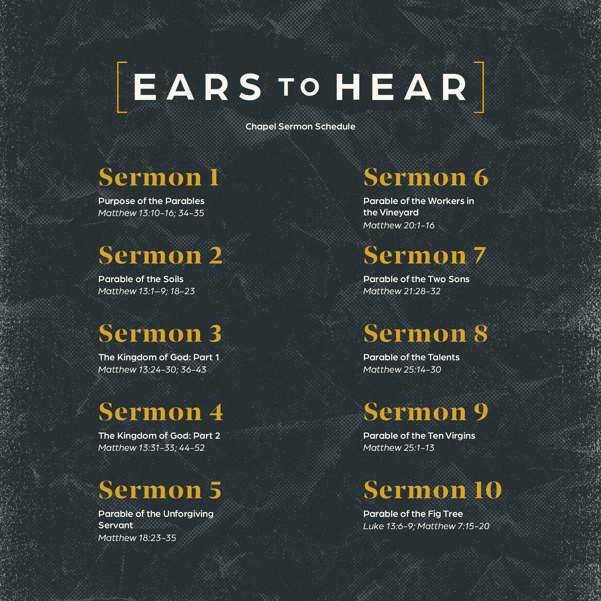
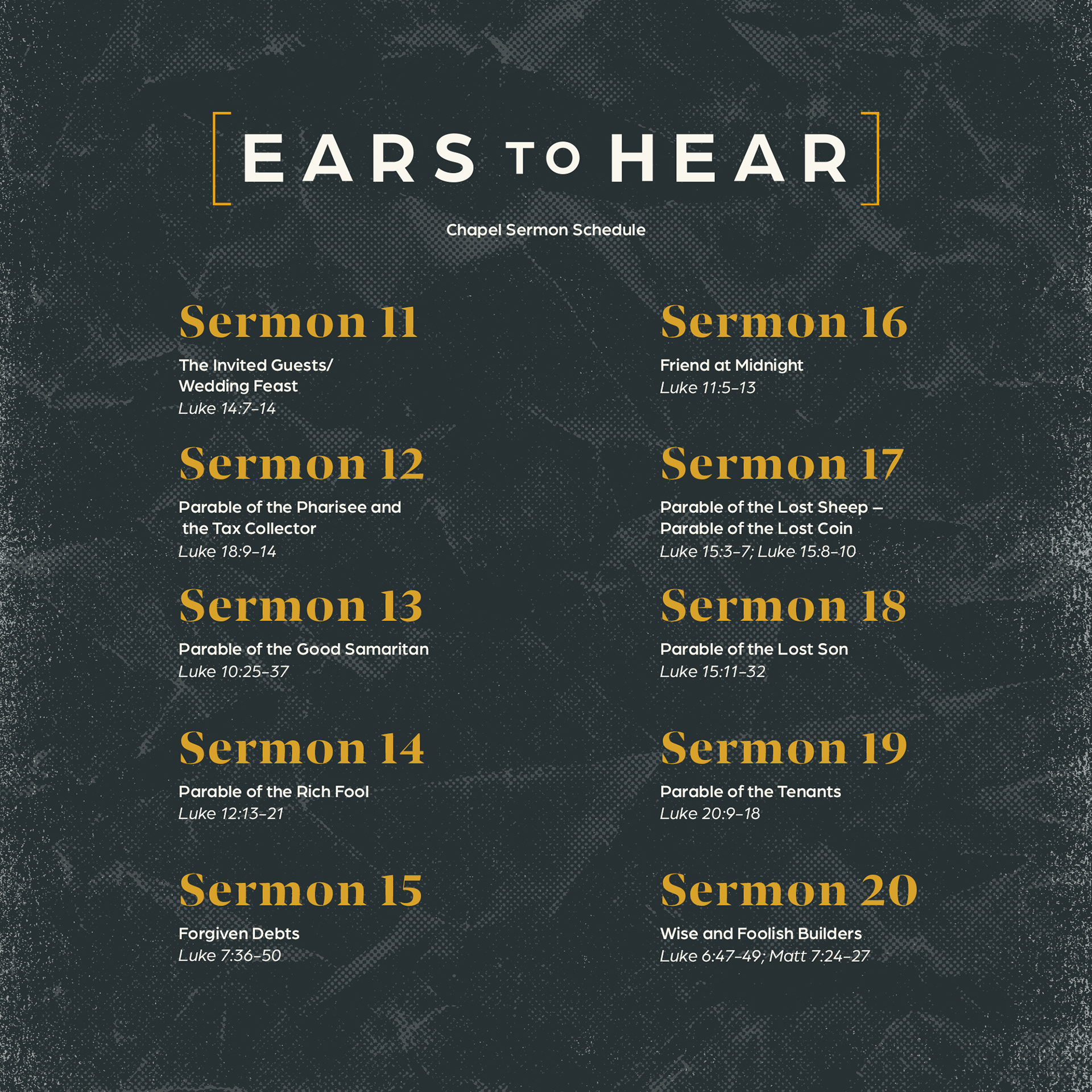
Once the main graphics had been created, I implemented them across a variety of channels. The above graphics were used on social media to announce the message schedule for the year.

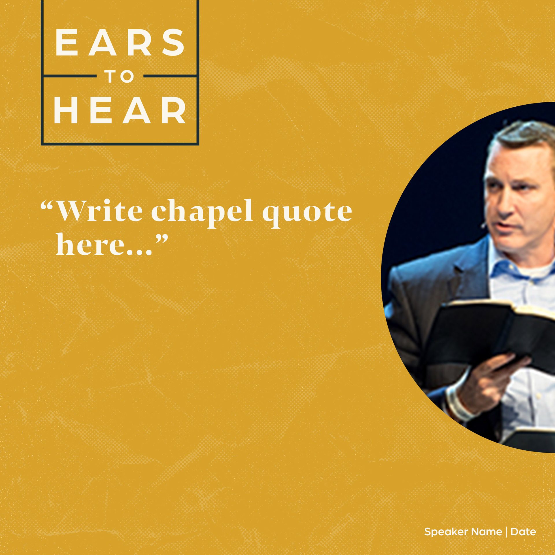



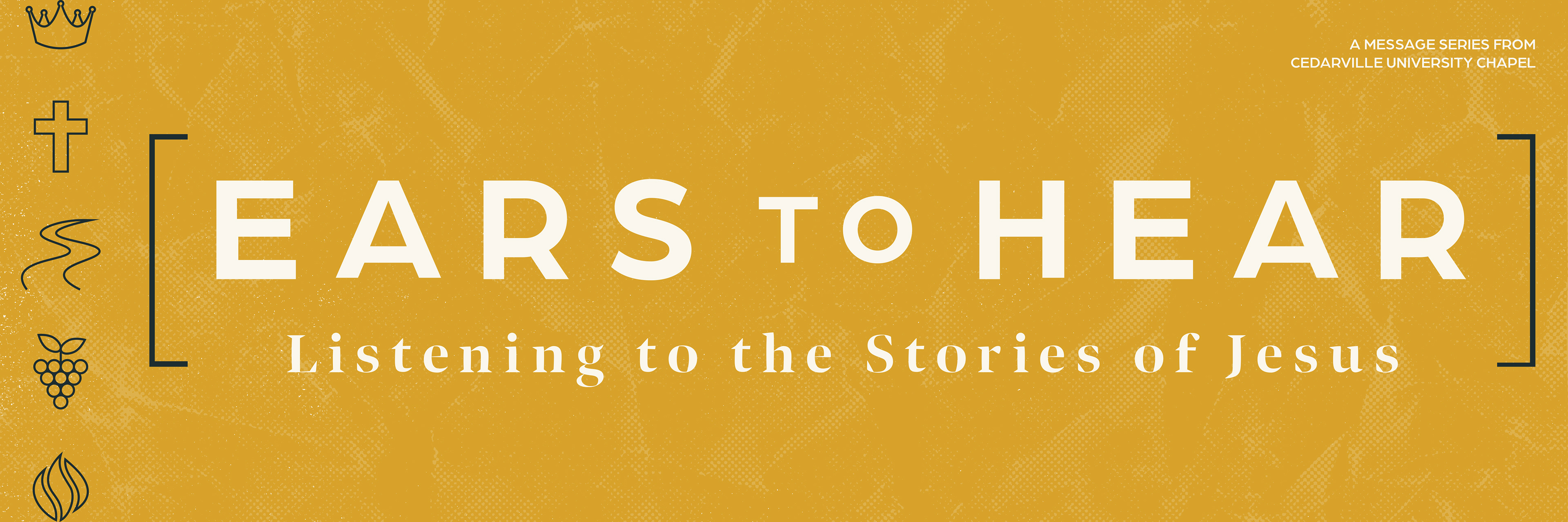
Above: Various graphics and templates created for Cedarville University's marketing team to use throughout the year. Rather than using the university branding for chapel posts, use of the new theme branding gives a unique feel to posts relating to this sermon series that is recognizable to students and page followers.
Above: Cedarville's Instagram page with announcement graphics for the new message series: "Ears to Hear"
